Background
Difficulty Configuring the App Without Support Team Assistance
Configuring a tenant in Turvo is difficult, due to a variety of usability and information architecture problems. Settings, rules, and configurations are scattered across the platform, presented inconsistently, and their purpose is often ambiguous. Adding new configurations is burdensome to the product team because it is unclear how to fit them in.

The Crew
Engineering & Product
The team included a Design Manager, a Product Manager (joining in phase two), myself, another designer, and the engineering team (Architect, senior engineers, and Engineering Manager). I led weekly meetings and collaborated on project strategy.
My Role as Lead Designer
I led the research, UX, UI, and interaction design, with a junior designer assisting with data organization and documentation.
Bigger picture
Self-Serve Tenant Setup
This project is part of a larger initiative to make Turvo fully self-serve. This means our customers will be able to set up their tenant on their own, without the involvement of the support or onboarding teams.
2
1
Current Initiative
Fix the Admin Console by making it a scalable and user-friendly system.
Bring the current extensive list of backend toggles into the updated Admin Console
Objectives & Key Results
Discovery
Current situation
Some numbers we've been working with.
> 80
Settings in UI
~170
Settings in backend
~3-6 months
Onboarding time
> 10 p/c
# of Support ticket
Problems Overview & Impacted Personas
There was a long list of problems reported over the years by internal teams and customers. I confirmed if they were still relevant, added a couple of new ones, and then organized them into groups based on categories.

Customer's Admin
A variety of usability and information architecture problems make it impossible for an admin to set up a customer's tenant without engaging with Turvo support for several months.

Product team
Multiple different locations within the Admin console for feature enablement and definitions create confusion among the team about where new features should be added.

Engineering team
A framework that is not scalable for adding controls from the backend
In more detail...


Other Problems

Problems -> Job Stories
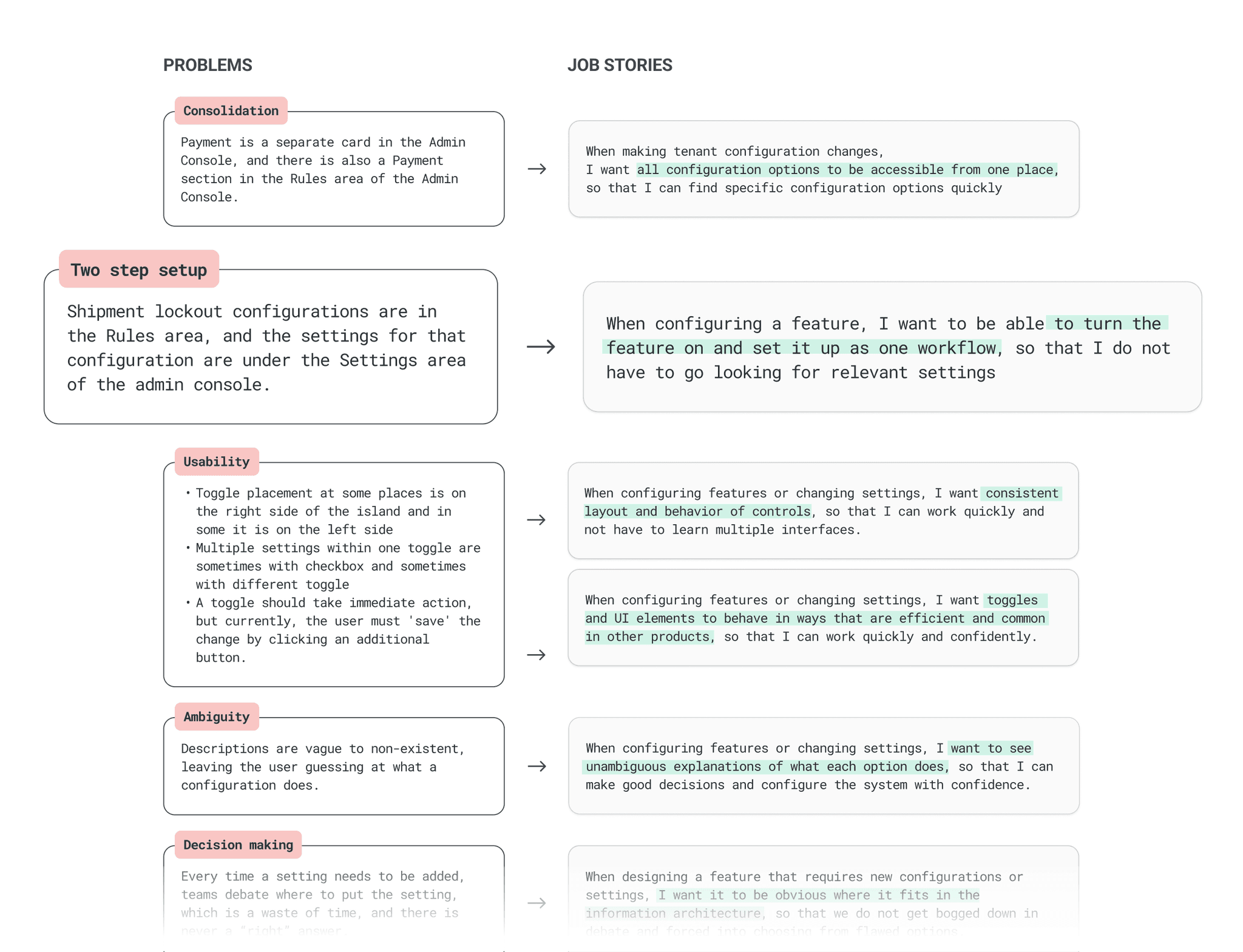
Once we identified the problems, we put together relevant job stories to provide clear and actionable context of the user's needs. Then, I prioritized the job stories based on their impact and alignment with the user's needs.

Tenant Setup Requirements
Job stories helped us frame the requirements for configuring the tenant process.
The Admin Console landing must have a clear and intuitive structure, with well-labeled features that provide users a high-level understanding of their purpose and functionality.
All configuration options must be accessible from a centralized location.
Users should be able to view all available settings and configurations.
Related settings must be grouped together under a parent category with a consistent and logical structure.
Users should be able to browse the list of options easily and navigate quickly between settings.
The system must display which configurations are enabled by default.
The feature should be enabled and set up through a single, seamless workflow.
The layout and behavior of controls must remain consistent throughout the feature.
Toggles and UI elements must function efficiently and in ways that are common across other products.
When new settings or configurations are introduced, users must be informed of their availability and potential benefits.
Users must be able to understand how configuring a feature or setting will affect the platform.
Card Sorting Exercise to Identify Logical Groupings
Using the existing sections within the Admin Console, I conducted a card sorting exercise with 10 internal stakeholders to identify logical groupings within the Admin.
Participants:
10 Turvo internal stakeholders
Source used:
Optimal Workshop


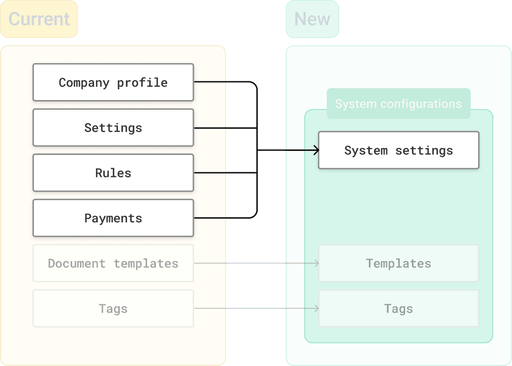
⚡️ Instead of 14 cards, we ended up with 4 logical groups, each containing sections associated with that group.

->
To address multiple issues mentioned earlier, those sections were combined into one—System Settings.
Design Solution
Redesign of Admin Landing Page to Accommodate Four Identified Groups
There were multiple rounds of design iterations and testing with stakeholders. We experimented with using images, iconography, and different layouts.

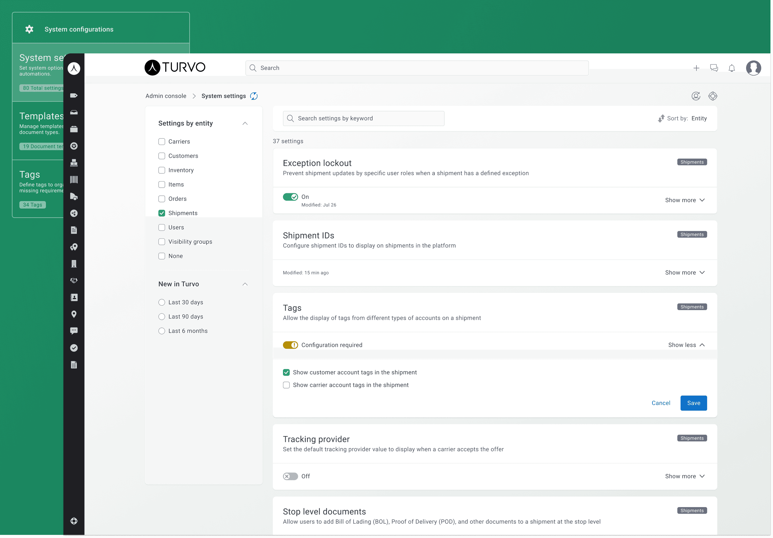
We ended up with this view—clean, simple, scalable—and it provides the necessary information for each section so the user can easily understand what each section is about.

System Settings: A merge of Settings, Rules, Company Profile, and Payments sections.
Actionable cards with seamless feature setup
I began iterating on possible designs to simplify the process of configuring features and ended up with the concept of actionable cards for seamless feature setup.
->
One centralized location for all configurations with filtering capabilities
Then I considered how our users could quickly access the necessary settings by providing filters and search options
First Version of the Design
After aligning the approach with internal stakeholders, I applied styles from the Turvo design system and proposed using green for input components instead of the current blue.

Usability Test
Are We on the Right Path?
Evaluating Color Acceptance, Toggle Functionality, and layout of System Settings
Objective
Validate the end-to-end flow for locating and configuring settings, including the use of an intermediate 'configuration required' state.
Additionally, assess users' acceptance of green as the primary color for input components compared to the current blue design.
Methodology
We conducted 1:1 sessions with ten participants—five from Turvo's internal team and five from our customer base, including representatives from Lineage, Ryder, Port X, Genpro, and Jones Transport.
Each 30-minute session involved participants interacting with a Figma prototype while completing assigned tasks. During the sessions, we closely observed their behaviors and engaged them in discussions to gather insights and feedback on their experiences.
Results
The overall impression of the system settings is positive; there are no significant barriers to locating and configuring the necessary settings.
Participants found the yellow 'Configuration Required' toggle state to be clear and intuitive.
However, several issues were raised regarding component behavior and the general layout.
Additionally, participants preferred the use of green instead of the current blue for the inputs.

The design has been updated based on the results of usability testing

Final Design
Revisiting and Redesigning 79 Configurations to Align with Established Patterns
After finalizing the general layout and card behavior, I worked on each setting using established templates for the configuration area
I also revisited the copy for each setting to ensure it's easy for users to understand its function.

Prototype of Tenant Configuration Flow
Metrics to Track
Ensure Achievement of Goals and Understand Settings Usage
Overall Settings Usage
->
Improvement in customer onboarding time
->
Settings that have been enabled and subsequently disabled for the same customer
->
Settings configured by admin across all customers
Reduction in Support Tickets
->
Total number of support tickets during new customer setup
->
Number of times the Help Center is accessed during customer setup
Component Usage
->
Keywords entered in the search box
->
Most frequently filtered entities in the settings list across all customers
->
Most frequently selected "Sort by" option across all customers
->
Number of times the "push to refresh" button is clicked per customer
Project Challenges
Problems Faced and How They Were Overcome
Lack of proper documentation for existing app settings and their purposes.
Confusing copy for settings, making it difficult for even internal stakeholders to understand their function.
The project requires the involvement of the entire Product team, distributed across the globe, to ensure the configurations meet everyone's needs.
No established design patterns or templates to guide the redesign of the settings.
Solutions
1
Identified each configuration, understood its functionality, and created quick mocks based on that understanding.
2
Grouped mocks by entity.
3
Established a set of patterns and templates for reuse.

4
Created a comprehensive document of all existing configurations, including:
•
Design links, status, and current/updated copy (synced with Figma via Google Sync plugin).
•
Key information for collaboration across Product, UX, and Engineering teams (e.g., splitting/merging settings, associated tags, etc.).
